Making a CSS3 Animated Menuの使い方
- 下記ページの「DOWNLOAD」よりファイル1式をダウンロード。
- ダウンロードしたファイルを任意の場所にコピー。
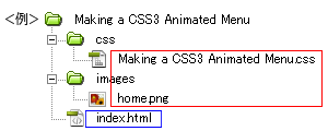
- 動作させるファイル(サンプルではindex.html)にコードを記述。
<パスは上記ファイル構成の場合なので環境にあわせて変更>
・head部分にcssファイルを読み込ませるためのコードを記述。<head> <!--ダウンロードしたファイル--> <link rel="stylesheet" type="text/css" href="css/Making a CSS3 Animated Menu.css" /> </head>
サンプルのcssコード(サンプルのcssは改変しています)
/*ページ設定部分(style.cssなどで設定していれば削除する)*/ body { margin: 0; padding: 0; background: #555; } #container { width: 700px; margin: 50px auto; } /*ここまでページ設定部分*/ /*ここからMaking a CSS3 Animated Menuの設定*/ .fancyNav { /* Affects the UL element */ overflow: hidden; display: inline-block; } .fancyNav li { /* Specifying a fallback color and we define CSS3 gradients for the major browsers: */ background-color: #f0f0f0; background-image: -webkit-gradient(linear, left top, left bottom, from(#fefefe), color-stop(0.5, #f0f0f0), color-stop(0.51, #e6e6e6)); background-image: -moz-linear-gradient(#fefefe 0%, #f0f0f0 50%, #e6e6e6 51%); background-image: -o-linear-gradient(#fefefe 0%, #f0f0f0 50%, #e6e6e6 51%); background-image: -ms-linear-gradient(#fefefe 0%, #f0f0f0 50%, #e6e6e6 51%); background-image: linear-gradient(#fefefe 0%, #f0f0f0 50%, #e6e6e6 51%); border-right: 1px solid rgba(9, 9, 9, 0.125); /* Adding a 1px inset highlight for a more polished efect: */ box-shadow: 1px -1px 0 rgba(255, 255, 255, 0.6) inset; -moz-box-shadow: 1px -1px 0 rgba(255, 255, 255, 0.6) inset; -webkit-box-shadow: 1px -1px 0 rgba(255, 255, 255, 0.6) inset; position: relative; float: left; list-style: none; } .fancyNav li:after { /* This creates a pseudo element inslide each LI */ content: '.'; text-indent: -9999px; overflow: hidden; position: absolute; width: 100%; height: 100%; top: 0; left: 0; z-index: 1; opacity: 0; /* Gradients! */ background-image: -webkit-gradient(linear, left top, right top, from(rgba(168,168,168,0.5)), color-stop(0.5, rgba(168,168,168,0)), to(rgba(168,168,168,0.5))); background-image: -moz-linear-gradient(left, rgba(168,168,168,0.5), rgba(168,168,168,0) 50%, rgba(168,168,168,0.5)); background-image: -o-linear-gradient(left, rgba(168,168,168,0.5), rgba(168,168,168,0) 50%, rgba(168,168,168,0.5)); background-image: -ms-linear-gradient(left, rgba(168,168,168,0.5), rgba(168,168,168,0) 50%, rgba(168,168,168,0.5)); background-image: linear-gradient(left, rgba(168,168,168,0.5), rgba(168,168,168,0) 50%, rgba(168,168,168,0.5)); /* Creating borders with box-shadow. Useful, as they don't affect the size of the element. */ box-shadow: -1px 0 0 #a3a3a3, -2px 0 0 #fff, 1px 0 0 #a3a3a3, 2px 0 0 #fff; -moz-box-shadow: -1px 0 0 #a3a3a3, -2px 0 0 #fff, 1px 0 0 #a3a3a3, 2px 0 0 #fff; -webkit-box-shadow: -1px 0 0 #a3a3a3, -2px 0 0 #fff, 1px 0 0 #a3a3a3, 2px 0 0 #fff; /* This will create a smooth transition for the opacity property */ -moz-transition: 0.25s all; -webkit-transition: 0.25s all; -o-transition: 0.25s all; transition: 0.25s all; } /* Treating the first LI and li:after elements separately */ .fancyNav li:first-child { border-radius: 4px 0 0 4px; } .fancyNav li:first-child:after, .fancyNav li.selected:first-child:after { box-shadow: 1px 0 0 #a3a3a3, 2px 0 0 #fff; -moz-box-shadow: 1px 0 0 #a3a3a3, 2px 0 0 #fff; -webkit-box-shadow: 1px 0 0 #a3a3a3, 2px 0 0 #fff; border-radius: 4px 0 0 4px; } .fancyNav li:last-child { border-radius: 0 4px 4px 0; } /* Treating the last LI and li:after elements separately */ .fancyNav li:last-child:after, .fancyNav li.selected:last-child:after { box-shadow: -1px 0 0 #a3a3a3, -2px 0 0 #fff; -moz-box-shadow: -1px 0 0 #a3a3a3, -2px 0 0 #fff; -webkit-box-shadow: -1px 0 0 #a3a3a3, -2px 0 0 #fff; border-radius: 0 4px 4px 0; } .fancyNav li:hover:after, .fancyNav li.selected:after, .fancyNav li:target:after { /* This property triggers the CSS3 transition */ opacity: 1; } .fancyNav:hover li.selected:after, .fancyNav:hover li:target:after { /* Hides the targeted li when we are hovering on the UL */ opacity: 0; } .fancyNav li.selected:hover:after, .fancyNav li:target:hover:after { opacity: 1 !important; } /* Styling the anchor elements */ .fancyNav li a { color: #5d5d5d; display: inline-block; font: 20px/1 Lobster, Arial, sans-serif; padding: 12px 35px 14px; position: relative; text-shadow: 1px 1px 0 rgba(255, 255, 255, 0.6); z-index: 2; text-decoration: none !important; white-space: nowrap; } .fancyNav a.homeIcon { background: url('../images/home.png') no-repeat center center; display: block; overflow: hidden; padding-left: 12px; padding-right: 12px; text-indent: -9999px; width: 16px; }・<body></body>内にコードを記述<ul class="fancyNav"> <li id="home"> <a href="#home" class="homeIcon"> Home </a> </li> <li id="news"> <a href="#news"> News </a> </li> <li id="about"> <a href="#about"> About us </a> </li> <li id="services"> <a href="#services"> Services </a> </li> <li id="contact"> <a href="#contact"> Contact us </a> </li> </ul>サンプルのhtmlコード
<!DOCTYPE html> <html lang="ja"> <head> <meta charset="utf-8" /> <title>Making a CSS3 Animated Menu</title> <link rel="stylesheet" type="text/css" href="css/Making a CSS3 Animated Menu.css" /> <link rel="stylesheet" href="http://fonts.googleapis.com/css?family=Lobster" /> </head> <body> <div id="container"> <ul class="fancyNav"> <li id="home"> <a href="#home" class="homeIcon"> Home </a> </li> <li id="news"> <a href="#news"> News </a> </li> <li id="about"> <a href="#about"> About us </a> </li> <li id="services"> <a href="#services"> Services </a> </li> <li id="contact"> <a href="#contact"> Contact us </a> </li> </ul> </div> <a href="https://saetl.net/csssample.html"> <span style="position:fixed; right:10px; top:10px; font-size:1em; color:#fff;">CSSサンプル集 - Saetl.net</span> </a> </body> </html> - ファイル1式をサーバーにアップロードして設置完了。